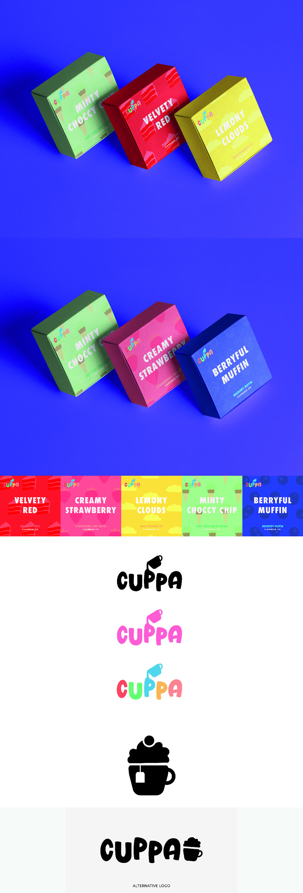
Cuppa Tea!
Beautifully composed packaging can be key to a cohesive brand or product. The design has to have curb appeal through stunning design and unique identity. Cuppa is a tea brand with a difference, the flavours are dessert inspired. Emphasising this difference, the packaging needed to be bright and colourful. Giving the flavours quirky names provides character to leave a lasting impression on customers. Although this colour scheme works for digital media, for print the pattern design would need higher contrast.

Pricing Guide
£15 per hour with £20 deposit fee
(Printing will require an extra charge)
Please use the contact form for further details on pricing.
Made with 💜 by Jamie Davenport
Copyright © Bethany Davenport