Health and Well-being reimagined
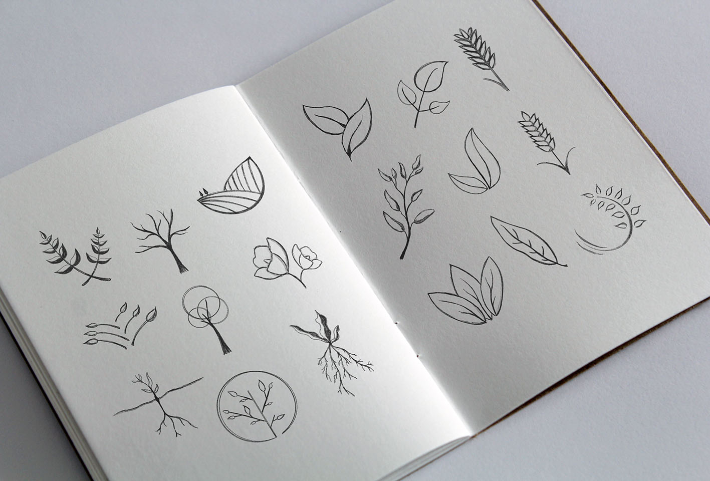
The designer has decided to reimagine a famous health company, based on her HNC project title of Well-being.
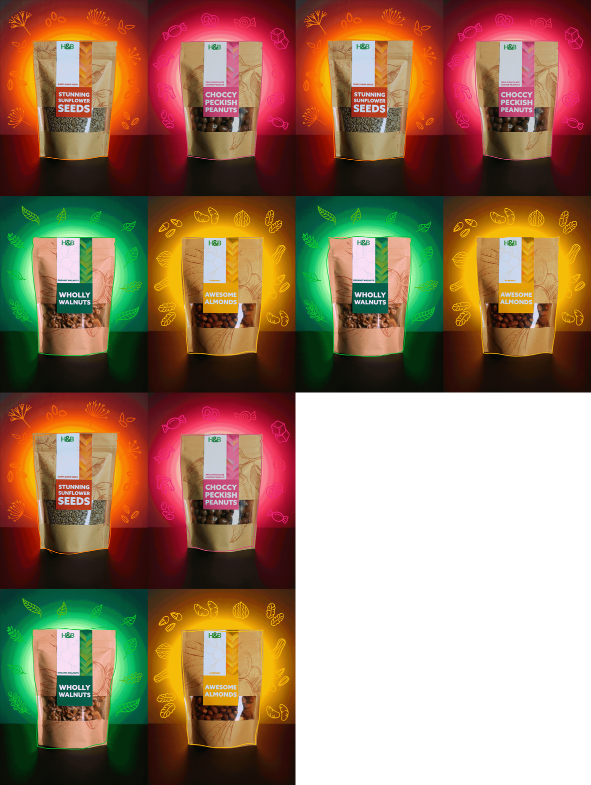
The artist wanted to create a logo, packaging and a moving image piece that fit into modern day life, whilst targeting a younger audience to encourage a healthier lifestyle. Bright colours were used to give the product curb appeal when displayed on shelves, and the stylish modern appearance was used to entise younger buyers. The print on the pouch was created using a screen-printing method, with an intentional natural appearance, to reflect the organic product.


Pricing Guide
£15 per hour with £20 deposit fee
(Printing will require an extra charge)
Please use the contact form for further details on pricing.
Made with 💜 by Jamie Davenport
Copyright © Bethany Davenport